Scroll-Driven Animations can be used for more than driving an animation by scroll. In this post, I share how you can use Scroll-Driven Animations to detect the Scroll Velocity a user is actively scrolling in.
That means that using only CSS you can style an element based on whether the user is scrolling (or not scrolling), the direction they are scrolling in, and the speed they are scrolling with.
~
Table of Contents
~
💁♂️ This article assumes you know the basics of Scroll-Driven Animations. If you don’t, then get yourself acquainted with it over at scroll-driven-animations.style, which includes links to relevant articles and videos.
⚠️ Motion Warning – This article is all about animations so things will move around, often quite abruptly. When implementing these effects in your own projects, take prefers-reduced-motion into account.
👨🔬 Browser Compat Warning – The demos in this post rely on Scroll-Driven Animations and @property being available. In practice, this means you need a Chromium-based browser, version 115 or newer.
~
# The Code
If you’re here for just the code, here it is:
@property --scroll-position {
	syntax: "<number>";
	inherits: true;
	initial-value: 0;
}
@property --scroll-position-delayed {
	syntax: "<number>";
	inherits: true;
	initial-value: 0;
}

@keyframes adjust-pos {
	to {
		--scroll-position: 1;
		--scroll-position-delayed: 1;
	}
}

:root {
	animation: adjust-pos linear both;
	animation-timeline: scroll(root);
}

body {
	transition: --scroll-position-delayed 0.15s linear;
	--scroll-velocity: calc(var(--scroll-position) - var(--scroll-position-delayed));
	--scroll-speed: max(var(--scroll-velocity), -1 * var(--scroll-velocity)); /* abs(var(--scroll-velocity)); */
	--scroll-direction: calc(var(--scroll-velocity) / var(--scroll-speed)); /* sign(var(--scroll-velocity)); */

	--when-scrolling: abs(var(--scroll-direction));
	--when-not-scrolling: abs(var(--when-scrolling) - 1);

	--when-scrolling-up: min(abs(var(--scroll-direction) - abs(var(--scroll-direction))),	1);
	--when-scrolling-down: min(var(--scroll-direction) + abs(var(--scroll-direction)), 1);

	--when-scrolling-down-or-when-not-scrolling: clamp(0, var(--scroll-direction) + 1, 1);
	--when-scrolling-up-or-when-not-scrolling: clamp(0, abs(var(--scroll-direction) - 1), 1);
}
If you want to know how to use it and why this works, keep on reading 😉
~
# The Concept
When combining a few CSS things together, you often end up with a novel way to achieving something. A while ago, I figured out that you can detect the scroll speed and scroll direction using only CSS when combining the following:
@property- To register two custom properties of the type
<number>so that they can be animated. - Scroll-Driven Animations
- To animate those custom properties from
0to1on scroll. transition-delay- To delay the computation of the 2nd custom property on a child element of the scroller.
calc()- To compute the difference between both numbers, giving you the scroll velocity (= speed + direction).
sign()- To extract the scroll direction from the velocity, leaving you with a value of
1,0, or-1. abs()- To extract the scroll speed from the velocity.
If that’s all gibberish to you don’t worry, as I’ll explain it all in the next few sections.
~
# Animating two Custom Properties on scroll
Let’s start off at the start, by animating two custom properties on scroll. This is done using a Scroll Timeline which is attached to the root scroller.
@property --scroll-position {
	syntax: "<number>";
	inherits: true;
	initial-value: 0;
}
@property --scroll-position-delayed {
	syntax: "<number>";
	inherits: true;
	initial-value: 0;
}

@keyframes adjust-pos {
	to {
		--scroll-position: 1;
		--scroll-position-delayed: 1;
	}
}

:root {
	animation: adjust-pos linear both;
	animation-timeline: scroll(root);
}
Both of these values will animate from 0 to 1 as you scroll the document from top to bottom. Because they are registered through @property, they will interpolate nicely instead of animating discretely.
When referenced by animations and transitions, custom property values interpolate by computed value, in accordance with the type that they parsed as.
See the Pen
Detecting Scroll Directionality with Scroll-Driven Animations (DEBUG, v0) by Bramus (@bramus)
on CodePen.
~
# Delaying one of the Custom Properties
Animating two different properties in exactly the same way seems a bit stupid, but that’s where the rest of the trick comes into play. By delaying the --scroll-position-delayed property – using transition-delay – on a child of the scroller, you can have it lag on the parent.
body {
	transition: --scroll-position-delayed 0.15s linear;
}
It is very important to note that I’m delaying the --scroll-position-delayed on the body element, which is a child of html. By doing so, I am not lagging --scroll-position-delayed on --scroll-position but, instead, I am lagging the --scroll-position-delayed value of the body element on the --scroll-position-delayed value of the html element.
☝️ This parent-child relationship is a requirement for this trick to work – it won’t work if you delay --scroll-position-delayed on the scroller – here html – itself. You can draw a parallel to Container Queries here, which also require a parent-child relationship.
The set transition-delay controls how much lag there is before --scroll-position-delayed on the body catches up with the value from the html element. Best is to keep the delay pretty low, as the resulting effect could otherwise feel slow to users.
See the Pen
Detecting Scroll Directionality with Scroll-Driven Animations (DEBUG, v0) by Bramus (@bramus)
on CodePen.
Try scrolling up and down in the CodePen embedded above, and notice how --scroll-position-delayed lags on the --scroll-position variable. Repeat your test while scrolling very fast or really slow, and compare the effect of both speeds to each other.
~
# Calculating the Scroll Velocity
Because the computed values of the --scroll-position and --scroll-position-delayed properties differ as you scroll, you can use them to calculate the scroll velocity. By taking the difference of both values – using a regular calc() – you end up with a number that will be one of these:
- A positive float, ranging from
0to1, indicating the user is scrolling down 0, indicating the user is not scrolling- A negative float, ranging from
-1to0, indicating the user is scrolling up
In CSS, it looks like this:
body {
	transition: --scroll-position-delayed 0.15s linear;
	--scroll-velocity: calc(var(--scroll-position) - var(--scroll-position-delayed));
}
See the Pen
Detecting Scroll Directionality with Scroll-Driven Animations (DEBUG, v3) by Bramus (@bramus)
on CodePen.
Try scrolling up and down in the CodePen embedded above, and notice how --scroll-velocity is a float representing the scroll velocity. Repeat your test while scrolling very fast or really slow, and compare the effect of both speeds to each other.
🕵️ When looking really close, you might notice that the number is a bit off when quickly changing the direction or when abruptly stopping a scroll: the updated value of --scroll-velocity will not immediately reflect the actual state. This can be tweaked by tightening the transition-delay of the --scroll-position-delayed property, but then you end up with smaller values for --scroll-velocity so you might need a multiplier to counteract that.
There’s also a difference in update speed between dragging the scrollbar versus using the touchpad to scroll the scroller. The former updates much, much, faster.
~
# Calculating the Scroll Direction and Scroll Speed
Because Velocity is a measured Speed into a certain Direction (ref), the Direction and Speed can be extracted from the Velocity.
The direction of scrolling can be derived from the --scroll-velocity by looking at its sign: If it’s positive, then the user is scrolling down. If it is negative, the user is scrolling up.
In CSS, you can use the the sign() function to extract that info:
body {
	--scroll-direction: sign(var(--scroll-velocity));
}
The value for --scroll-direction is one of these:
1, indicating the user is scrolling down0, indicating the user is not scrolling-1, indicating the user is scrolling up
This value will come in handy in calculations further down the road.
Extracting the scroll speed from the velocity is also easy to do, as it’s a matter of dropping sign from the value. In CSS, this can be done using the abs() function.
body {
	--scroll-speed: abs(var(--scroll-velocity));
}
Put together, you get this:
See the Pen
Detecting Scroll Directionality with Scroll-Driven Animations (DEBUG, v4) by Bramus (@bramus)
on CodePen.
Try scrolling up and down in the CodePen above, and notice how --scroll-direction is an integer representing the scroll direction, unaffected by the scroll speed.
👨🔬 At the time of writing, sign() and abs() are available in Chrome only once you flip on the Experimental Web Platform Features feature flag on through chrome://flags.
Thankfully, the functionality can be polyfilled using some basic mathematics, as detailed by Ana Tudor in this post on CSS-Tricks.
body {
	--scroll-speed: max(var(--scroll-velocity), -1 * var(--scroll-velocity));
	--scroll-direction: calc(var(--scroll-velocity) / var(--scroll-speed));
}
~
# Basic demos
With these computed custom properties --scroll-velocity and --scroll-direction available it’s time to get creative …
~
# Tilted Colored boxes
A first demos are these boxes that get skewed in a certain angle depending on the scroll. The faster you scroll, the more skewed they get, with a maximum of 25 degrees.
.slider-item {
	transform: skew(calc(var(--scroll-velocity) * -25deg));
}
Furthermore the boxes also get the hue of their background-color rotated depending on the scroll direction.
.slider-item {
	background: hsl(calc(0deg + (145deg * var(--scroll-direction))) 50% 50%);
	transition: background 0.15s ease;
}
When idle, the boxes are red. When scrolling down they become green and when scrolling up they are blue. The transition of the background is eased at 0.15s.
See the Pen
CSS scroll-direction detection with Scroll-Driven Animations by Bramus (@bramus)
on CodePen.
~
# Motion Blur Scroll
Things also become interesting when using the --scroll-velocity and --scroll-speed values in a filter, as that function has many options. With it, you can create a Motion Blur effect, that even desaturates the content as you scroll.
See the Pen
CSS Motion Blur Scrolling by Bramus (@bramus)
on CodePen.
The blurring and desaturating is handled by the filter property. Some basic translation and opacity-meddling also takes place, to give it a rather cinematic effect. To always have a positive float value for use within all calculations, the code relies on --scroll-speed instead of --scroll-velocity which can become negative.
main {
	filter:
		blur(calc(2rem * var(--scroll-speed)))
		contrast(calc(100% - (500% * var(--scroll-speed))))
		saturate(calc(100% - (500% * var(--scroll-speed))));
	opacity: calc(1 - (var(--scroll-speed) * 4));
	translate: calc(-8rem * var(--scroll-velocity)) 0;
}
Furthermore the entire photostrip gets skewed a tiny bit while scrolling, similar to a previous demo.
.photo {
	transform: skew(calc(var(--scroll-velocity) * 3deg));
}
The faster your scroll, the harder the effect is.
~
# Intermezzo: what about Style Queries?
UPDATE 2023.10.26 After chatting with Tab Atkins about this, it became clear that the simplification won’t happen until the custom property is registered as a <number> – something I wasn’t aware of. This section has been rewritten to incorporate that info.
Now, you might be wondering if you can use Style Queries for easier styling when relying on only the scroll direction. It’s definitely a valid question, as doing the calculations can be hard to get right, with a lot of trial and error.
After all, it would be so much easier if you could do this, allowing you to put any styles in the container blocks:
@container style(--scroll-direction: 0) { /* Idle */
  …
}

@container style(--scroll-direction: 1) { /* Scrolling down */
  …
}

@container style(--scroll-direction: -1) { /* Scrolling up */
  …
}
According to the spec any mathematical expression should be simplified:
The computed value of a math function is its calculation tree simplified, using all the information available at computed value time.
So when idling, the computed value of --scroll-direction should become 0, right? Unfortunately that doesn’t seem to be the case: when checking the computed value of --scroll-direction when idle, it computes to sign(calc(0 - 0)), without any simplification applied. Huh?!
The reason why simplification doesn’t happen is that the browser doesn’t know that it can. A custom property can hold any value; It’s only when it’s being used as a value – via var() – that the browser tries to convert the custom property to be of a certain type that fits the property it is used in. If the type conversion doesn’t work out – e.g. when trying to set a color as the value for an animation-duration – the declaration will become “Invalid At Computed Value Time”.
~
# @property to the rescue!
So, can you force the conversion to happen, in order for the simplification to occur? Why yes you can! By registering --scroll-direction – using @property – to be a <number>, the browser will try to fit the declared value into that type. At that point the simplification will occur, and sign(calc(0 - 0)) can be simplified to 0
@property --scroll-direction {
	syntax: "<number>";
	inherits: true;
	initial-value: 0;
}
With this registration, it now becomes possible to use style queries for the styling based on the scroll direction:
@container style(--scroll-direction: 0) { /* Idle */
	.slider-item {
		background: crimson;
	}
}
@container style(--scroll-direction: 1) { /* Scrolling down */
	.slider-item {
		background: forestgreen;
	}
}
@container style(--scroll-direction: -1) { /* Scrolling up */
	.slider-item {
		background: lightskyblue;
	}
}
See the Pen
CSS scroll-direction detection with Scroll-Driven Animations (Style Queries) by Bramus (@bramus)
on CodePen.
💁♂️ Compare the non-registered vs registered behavior
Here’s a small CodePen that tests the simplification/seriallization of calc(). The value of the --output property eventually becomes calc(2 * 0.5), because the custom property is not registered to be of a certain type.
See the Pen
ComputedStyle vs calc() by Bramus (@bramus)
on CodePen.
Now compare this to this adjusted version where the custom property is registered as a <number>:
See the Pen
ComputedStyle vs calc() – Registered Custom Property by Bramus (@bramus)
on CodePen.
~
# Combine multiple scroll states, thanks to more Maths
Thanks to some more basic maths, it’s possible to end up with a value of 1 in various scroll-cases.
For example, if you take the absolute value of --scroll-direction – which is either -1, 0, or 1 – you end up with a value of 1 only when the user scrolling:
body {
	--when-scrolling: abs(var(--scroll-direction));
}
Furthermore, if you take that value, subtract 1 from it, and absolute the result, you end up with a value of 1 only when the user is not scrolling:
body {
	--when-scrolling: abs(var(--scroll-direction));
	--when-not-scrolling: abs(var(--when-scrolling) - 1);
}
Mix and match basic maths, abs, min, max, clamp, and you can end up with a value of 1 in any of these situations:
- When scrolling up or down
- When not scrolling
- When scrolling up
- When scrolling down
- When scrolling up or idle
- When scrolling down or idle
In code, it looks like this:
body {
	--when-scrolling: abs(var(--scroll-direction));
	--when-not-scrolling: abs(var(--when-scrolling) - 1);

	--when-scrolling-up: min(abs(var(--scroll-direction) - abs(var(--scroll-direction))), 1);
	--when-scrolling-down: min(var(--scroll-direction) + abs(var(--scroll-direction)), 1);

	--when-scrolling-down-or-when-not-scrolling: clamp(0, var(--scroll-direction) + 1, 1);
	--when-scrolling-up-or-when-not-scrolling: clamp(0, abs(var(--scroll-direction) - 1), 1);
}
Look at the examples below for some use-cases. Don’t forget to register these as a <number> if you want to use these in Style Queries.
~
# Demo: Moving Header
One example where you can use this is to hide the header and footer bars while the user is scrolling. This is done by translating the bars out the way in that case. For this, the code uses --when-scrolling – which has a value of 1 when scrolling and a value of 0 when not scrolling – as the condition for the calculation.
body {
	--hide-bars: var(--when-scrolling);
}

header {
	top: 0;
	translate: 0 calc(-90% * var(--hide-bars));
}

footer {
	bottom: 0;
	translate: 0 calc(90% * var(--hide-bars));
}
The demo below requires Chrome with the Experimental Web Platform Features feature flag enabled.
See the Pen
CSS scroll-direction detection with Scroll-Driven Animations with moving header by Bramus (@bramus)
on CodePen.
💭 Initially I wanted to hide the header upon scrolling down or remaining idle after having scrolled down, and only show it again once starting to scroll up again. I couldn’t immediately find a solution here – using --when-scrolling-down-or-when-not-scrolling also hides it on initial load, which is not what I want – but I’m sure Johannes will be able to tell me how to do it using Scroll-Persisted State.
~
# Demo: Directional Chicky Scroll
When Brecht De Ruyte explored Scroll-Driven Animations back in February, he built a demo where a little chicky walks across the screen as you scroll the page. While building that demo he noted that when scrolling up, the chicky is facing the wrong direction:
The downside is that my animation seems to trigger a bit of moonwalking when scrolling back to top. Let’s just call it a feature for now, ok? 😉
With --scroll-direction available it’s pretty easy to flip the chicky in the other direction by passing that into scaleX(). However, when idling you’d end up with a scaleX() of 0 so to counter that I add --when-not-scrolling to the equation. By doing so, the scaleX() will also be 1 when idle, so the chicky will face forwards in that case.
@keyframes moveChicky {
  …
  transform: translateX(80px) scaleX(calc(var(--scroll-direction) + var(--when-not-scrolling)));
  …
}
The demo below requires Chrome with the Experimental Web Platform Features feature flag enabled.
See the Pen
Directional Chicky Scroll – scroll-driven-animation with CSS by Bramus (@bramus)
on CodePen.
~
# LERP-effects
Because there is a delay happening it’s possible to create typical LERP-effects. Below are a few demos that reproduce that.
💡 LERP = Linear intERPolation
~
# Demo: LERP Reading Indicator
In this demo, the reading indicator catches up on the actual reading position. The code is easy, as it relies directly on --scroll-position-delayed.
#progress {
	transform: scaleX(var(--scroll-position-delayed));
}
See the Pen
LERP Reading Indicator with Scroll-Driven Animations by Bramus (@bramus)
on CodePen.
Compare the behavior of the demo above to this original version whose reading indicator responds directly to the scroll position change.
~
# Demo: LERP Scrolling
Recreating a LERP scrolling effect is a bit more difficult as you don’t want to recreate an entirely custom scroller from scratch – These always end up in the uncanny valley. What I’ve done in the demo below is added some fake drag to the scroll by translating the contents in the opposite scrolling direction.
.slider {
	animation: adjust-pos linear both;
	animation-timeline: scroll(self); /* Hook animation onto self */
}

.slider-item {
	transition: --scroll-position-delayed 0.25s linear;
	--scroll-velocity: calc(var(--scroll-position) - var(--scroll-position-delayed));
	transform: translateY(calc(var(--scroll-velocity) * 500vh)); /* Add some drag. Tweak the 500vh value to adjust how much drag */
}
See the Pen
LERP Smooth Scrolling (CSS) by Bramus (@bramus)
on CodePen.
The effect is not entirely perfect though. For example, when hitting the end of the scroller the --scroll-position-delayed is still getting delayed while it should skip forwards in that case.
~
# More Demos
I’m sure this technique will spark a lot of nice new demos. Here’s a few more that I’ve built using this technique.
~
# Demo: Wormhole
By nesting a bunch of boxes, you can see how the value of --scroll-position-delayed propagates from box to box. Add some translation + colors, and you get a wormhole effect.
See the Pen
CSS Wormhole with Scroll-Driven Animations by Bramus (@bramus)
on CodePen.
The demo also includes the code to respond to a horizontal delayed scroll.
~
# Demo: BADASS
Back in 2017 I saw a nice scroll effect on the BADASS website. The site is no longer up in that state, but thankfully my blog entry about it also included a video of the effect, which I’ve also embedded below:
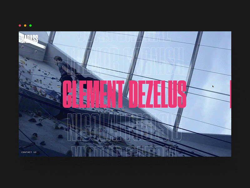
As I wrote back then:
The effect is achieved by placing a duplicate (but clipped) list on top of another one, in combination with scroll velocity calculation to define the slant of the list.
Recreating this effect is now perfectly possible with just CSS:
- Move the two lists across the screen as you scroll from top to bottom
- Adjust the
clip-pathof the hotpink list as you scroll - Adjust the slant of the outlined list depending on the scroll speed and direction
The difficult part here wasn’t to skew the list – this was already done in the other demos – but to get the clip-path working correctly. You can check the code for my calculations and comments.
See the Pen
Scroll-Driven Animations Scroll Detection: BADASS by Bramus (@bramus)
on CodePen.
🎬 Check a recording of this demo
~
# A note on performance
When doing a trace via Chrome DevTools you might notice that paint constantly gets triggered as you scroll.
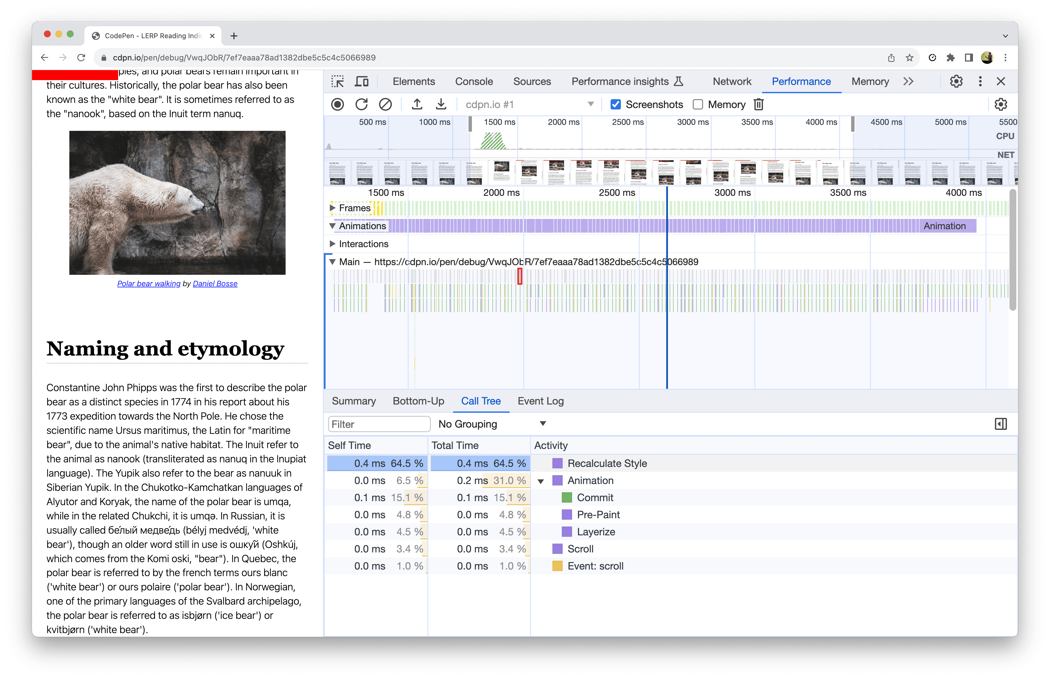
This is because Chrome – and any other browser for that matter – animates Custom Properties on the main thread. I have written about this problem space before, and hope to see this fixed in the future. Star Chromium Issue #1411864 to stay in the loop.
~
# Closing Thoughts
One of the features authors have asked about at the CSS Working Group is to expose current scrolling direction in CSS (w3c/csswg-drafts#6400). Not only does the technique described in this article offer an answer to that problem, it cranks it up a notch by also exposing the scrolling speed. While it’s not entirely perfect – e.g. the scroll velocity can lag a bit on the actual situation – it can already get you quite the distance.
Personally I think it is very exciting to see that Scroll-Driven Animations yet again ([1], [2], [3]. [4], [5], [6]) can be used for so much more than simply animating things as you scroll. I’m very much looking forward to more unconventional uses of this feature, unlocking some age-old requests …
~
# Spread the word
To help spread the contents of this post, feel free to retweet the announcements made on social media:
Scroll Detection, that’s something you need JS for, right?
Guess again! Thanks to Scroll-Driven Animations you can extract the scroll velocity, allowing you to style elements based on the active scroll direction and scroll speed 🤯
Article with demos: https://t.co/4E73JViy4C pic.twitter.com/PEpZjiR2F0
— Bramus (@bramus) October 23, 2023
~
🔥 Like what you see? Want to stay in the loop? Here's how:
Only works on Chrome, Firefox does not support this and properties aren’t updated 🙁
Correct. This information is included at the very start of the post.
Absolutely insane. I was specifically looking to see if it was possible to detect scroll direction purely using CSS. (I wanted to flip an image based on scroll direction.) Hopefully the proposal is adopted. I would also love position and size changes in container queries. (check if a container is growing or shrinking and what direction it is moving in.)
Really nice work and compelling examples.